Omnichannel UX/UI
WeChat Mini Program experience refresh
This project was part of the ongoing iteration of Thomas Cook China's WeChat Mini Program. I refreshed key screens, icons, membership benefits and product landing pages to make browsing, value communication and purchase paths clearer while giving internal teams a more consistent UI direction to build from.
Problem Statement
An evolving Mini Program needed clearer commerce and brand experience.
This was not a ground-up product redesign. It was a targeted refresh within an existing Mini Program. Several pages lacked clear hierarchy, icons felt inconsistent, membership benefits were under-explained, and product detail pages often behaved like information containers rather than persuasive purchase entry points.
Key pages lacked a shared hierarchy
Homepage, destination, membership and product detail pages used different visual priorities, making it harder for users to understand where to go and what mattered.
Membership value was not visible enough
The membership feature existed, but the benefits were not presented in a way that helped users quickly understand why joining mattered.
Ongoing iteration needed reusable standards
Internal teams and outsourced designers both contributed to page production, so clearer page briefs, modular direction and delivery standards were needed.
Core work: refreshing key experience touchpoints.
Instead of trying to redesign every page, I focused on the moments that shaped browsing, comprehension and purchase decisions: navigation entries, icon language, membership benefits, product detail pages and campaign-style landing pages.
01 / Product discovery
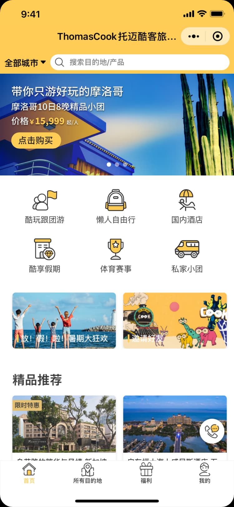
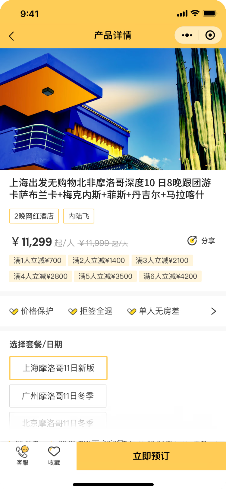
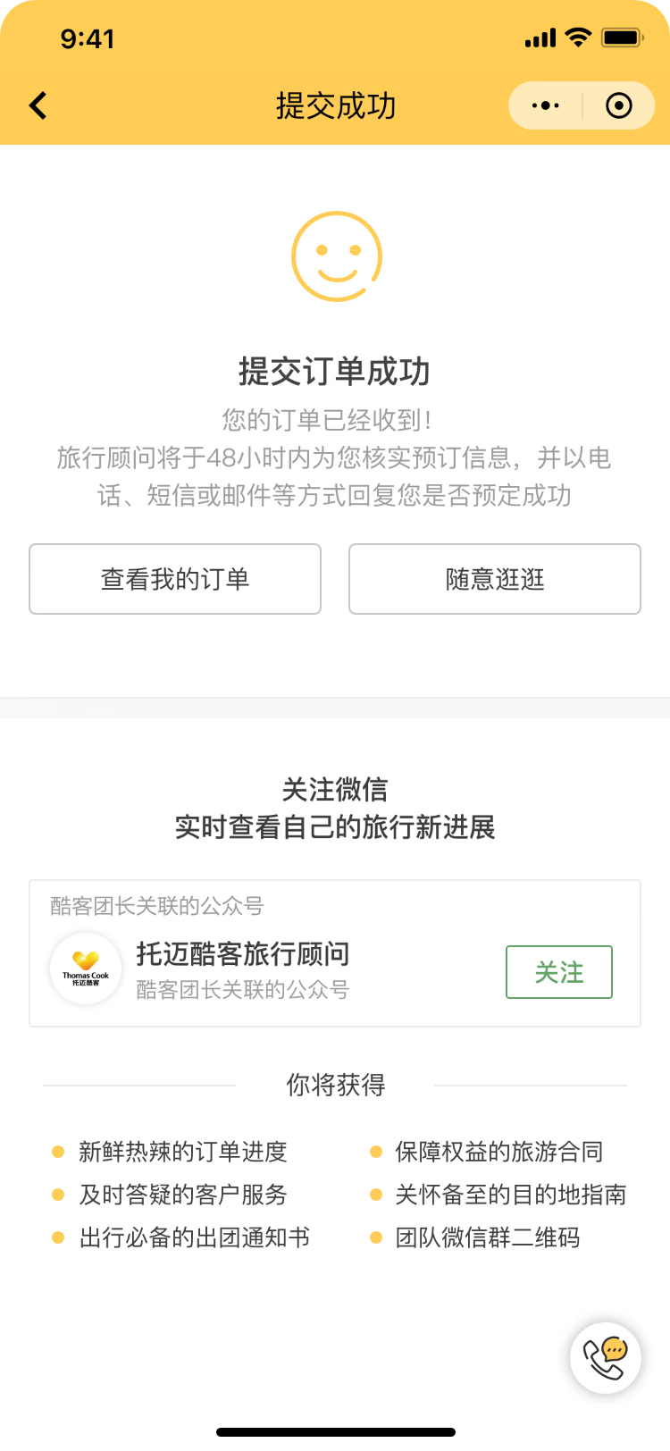
From homepage KV to PDP and order
The homepage campaign KV worked as a product entry point, leading users into the PDP and then toward the order action.
02 / Membership value
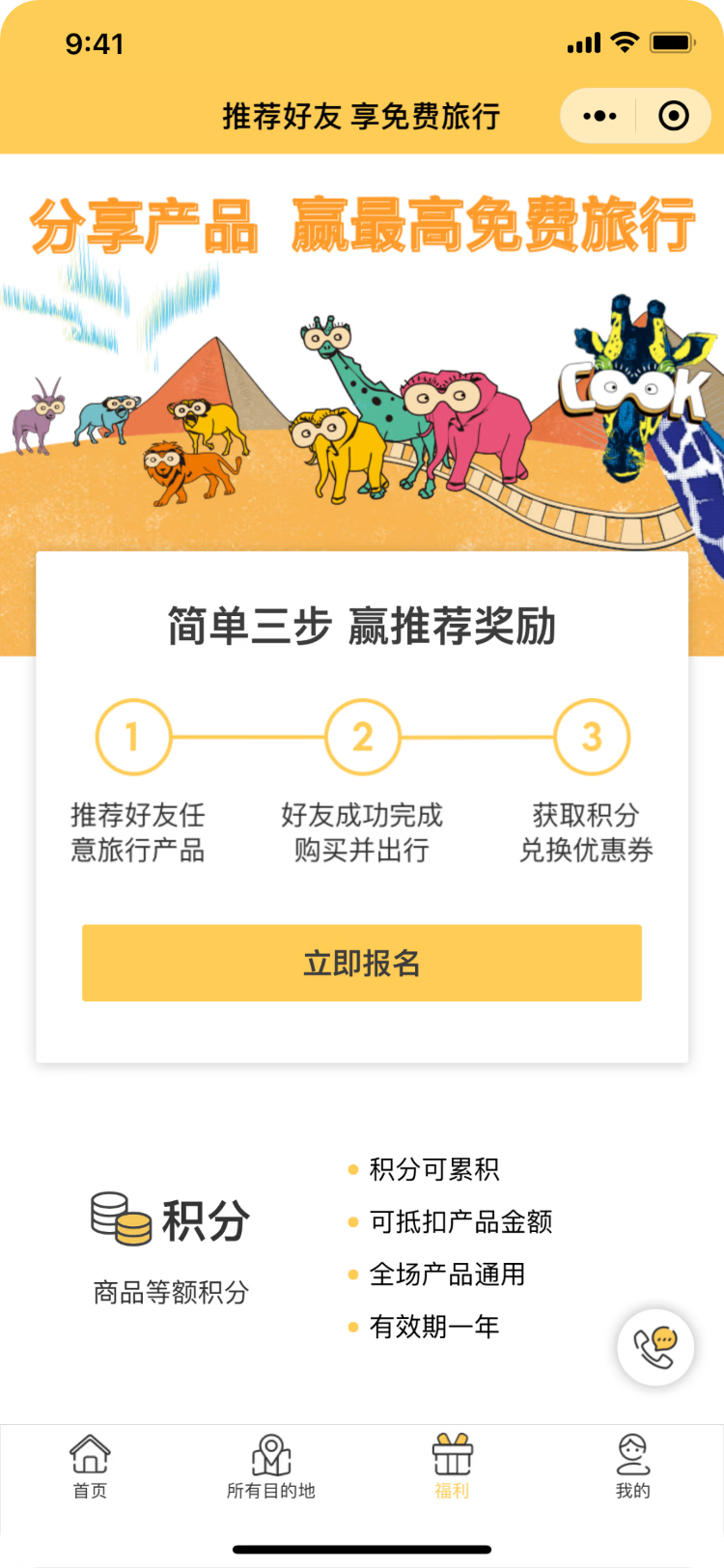
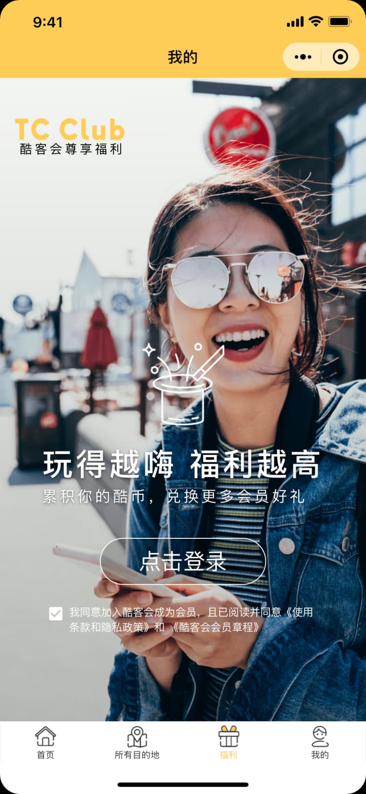
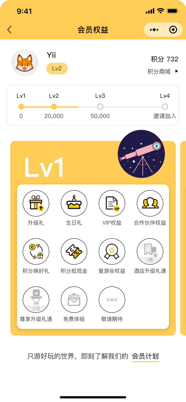
From perks entry to member benefits
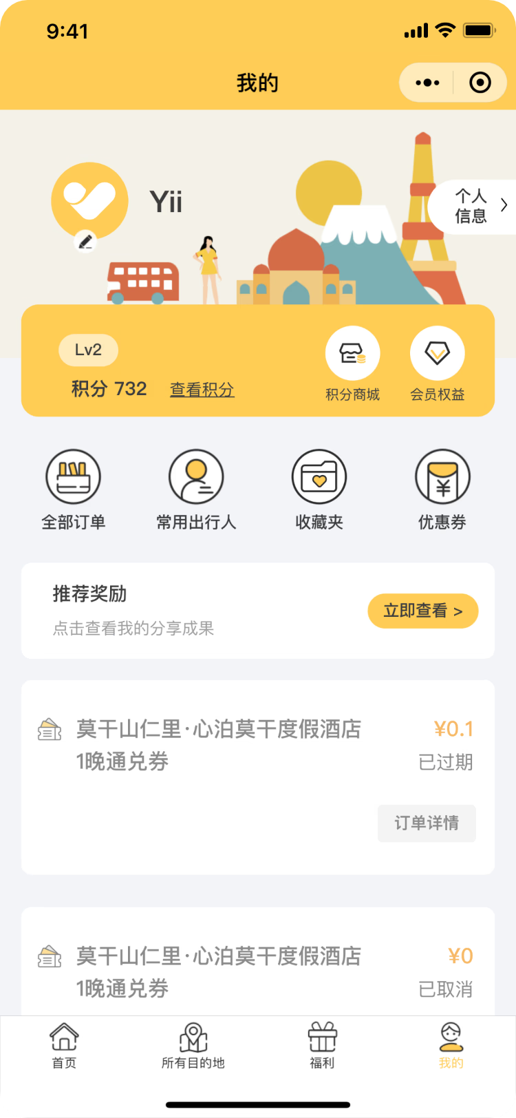
Offers and account pages worked together to make points, referrals and TC Club benefits easier to understand.
03 / Service confidence
From account entry to service proof
Account and About Us pages helped surface brand trust and service promise beyond the product detail page.
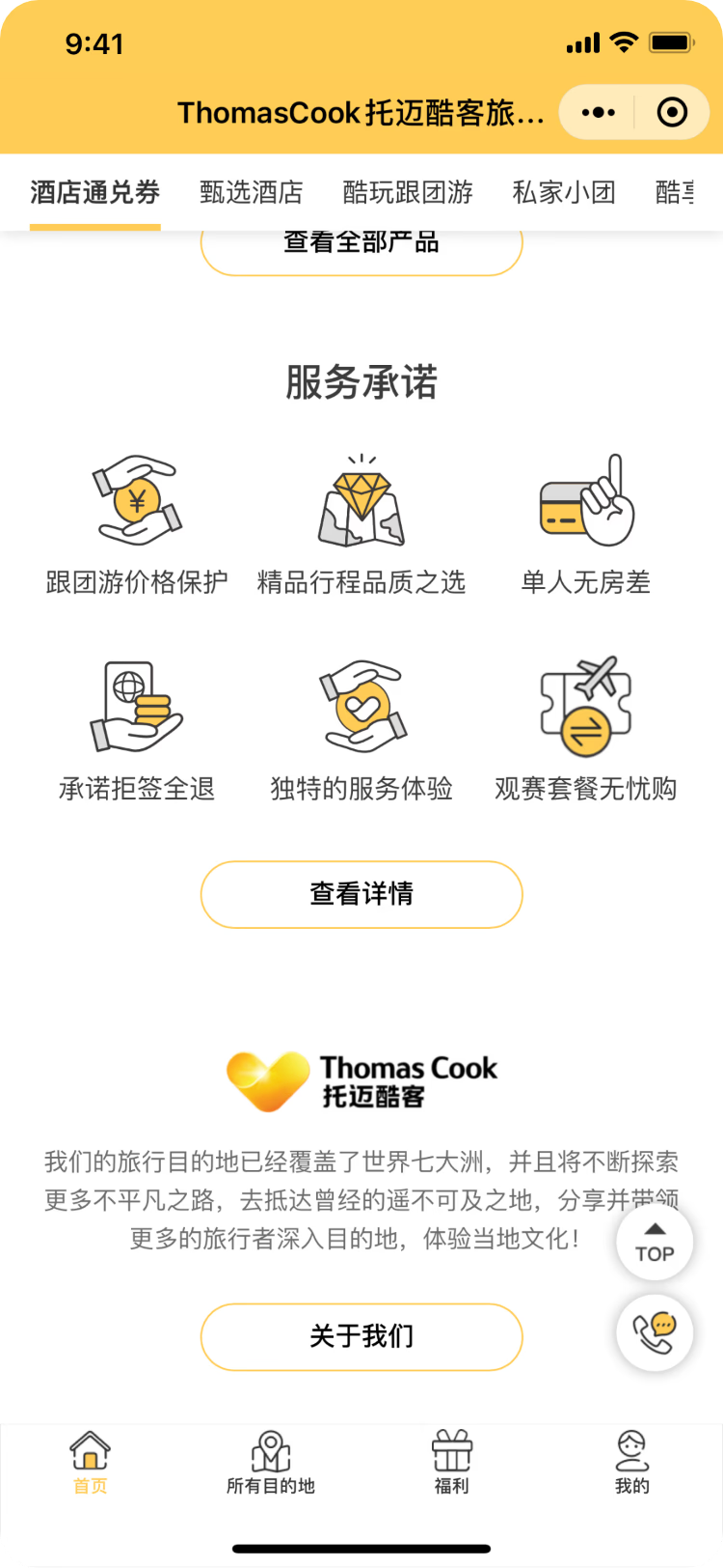
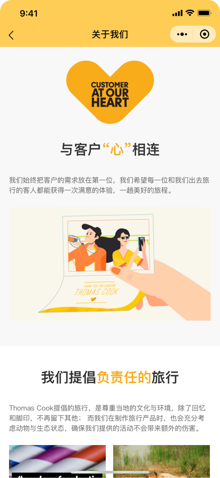
01
Homepage and core entries
Reorganised key entries and module hierarchy so users could find destinations, offers and account-related features faster.
02
Icon and visual language
Redesigned homepage and feature icons to improve recognition while keeping the interface closer to the brand.
03
Membership benefit expression
Turned membership from a functional section into a clearer value proposition that could support loyalty-building.
04
PDP and landing pages
Used the Morocco packaged tour as an example for a more editorial, brand-led product content experience.
Key experiment: turning product detail into a brand-led landing page.
The Morocco packaged tour was the strongest part of this iteration. Rather than treating the page as a long product information dump, it explored a more editorial landing-page style: establishing the destination mood first, then guiding users through benefits, highlights, itinerary details and service promises.
Clearer information structure
Price, benefits, product highlights, route map and itinerary content were separated into scannable modules to reduce friction in a long detail page.
Stronger brand feeling
Illustration, colour and travel-editorial composition helped the product feel less like a listing and more like a considered travel proposal.
More visible benefits
Membership value, service promises and reasons to buy were brought forward so users could understand what they gained before reading every detail.

Delivering within constraints: briefs, standards and quality control.
Because I joined mid-iteration, there was no full discovery phase. My role was to identify high-impact UI opportunities inside the existing system, then support execution through visual standards, internal page briefs and vendor coordination.
Internal page briefs
Created clearer module direction, hierarchy guidance and visual references so internal teams could extend pages with less repeated discussion.
Vendor coordination
Managed outsourced design work through clearer briefs and feedback, keeping delivery aligned with quality and brand expectations.
Iterative UI judgement
With limited room for structural redesign, I prioritised changes that improved clarity, recognition and purchase intent.
Result and impact
Clearer
Product and benefit comprehension
Updated modules made product highlights, membership value and key entry points easier to understand.
More consistent
Mini Program visual language
Icons, hierarchy and module styles became more unified, strengthening brand recognition and future iteration stability.
Directional lift
Click-through and purchase intent
The refreshed key modules supported stronger browsing interest and purchase performance, without publicly available precise metrics.
Reflection: finding design judgement in a mixed-scope project.
01
This was not my deepest UX case, but it trained me to identify what deserved attention inside real delivery constraints.
02
When a project touches many small things, the value is not in listing every output but in choosing the moments that affect user comprehension and business goals.
03
The lasting contribution was not simply producing more screens, but making the refresh easier to extend through clearer visual and delivery standards.